告别重复造轮子!Animista:在线CSS动画生成器的终极指南与实战技巧
在现代Web开发中,精致的动画效果是提升用户体验的关键因素。然而,手动编写CSS动画既耗时又容易出错,特别是要实现复杂的缓动函数和关键帧动画时。许多开发者花费大量时间重复编写相似的动画代码,或者因为实现复杂度而放弃使用动画效果。
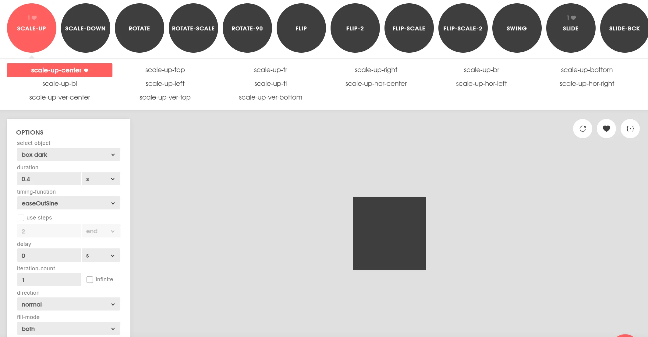
Animista 的出现完美解决了这个痛点。它是一个功能强大的在线CSS动画工具库,提供了数百种精心设计的动画效果,让开发者能够通过可视化界面快速生成高质量的CSS动画代码。本文将带你全面掌握Animista的使用技巧,并分享如何将这些动画优雅地集成到你的项目中。
为什么选择Animista?
在开始深入之前,让我们先看看为什么Animista如此受欢迎:
- 🎨 丰富预设:包含200+种精心调校的动画效果
- ⚙️ 实时定制:可视化调整所有动画参数
- 📋 一键复制:自动生成兼容性良好的CSS代码
- 🎯 零依赖:纯CSS实现,无需JavaScript库
- 💸 完全免费:个人和商业项目均可免费使用
Animista核心功能解析
1. 完整的动画分类体系
Animista将动画效果分为多个直观的类别:
/* 入场动画 */
.fade-in { /* 淡入效果 */ }
.slide-in-left { /* 左侧滑入 */ }
.rotate-in { /* 旋转进入 */ }

/* 强调动画 */
.pulse { /* 脉冲效果 */ }
.bounce { /* 弹跳效果 */ }
.jello { /* 果冻效果 */ }

/* 退场动画 */
.fade-out { /* 淡出效果 */ }
.slide-out-right { /* 右侧滑出 */ }
.roll-out { /* 滚动退出 */ }

/* 特殊效果 */
.shadow-drop { /* 阴影效果 */ }
.text-shadow { /* 文字阴影动画 */ }
.background-animation { /* 背景动画 */ }
2. 深度定制能力
每个动画都支持多种参数的精细调整:
:root {
  --animista-duration: 1.2s;      /* 动画时长 */
  --animista-delay: 0.5s;         /* 延迟时间 */
  --animista-iteration: 1;        /* 重复次数 */
  --animista-direction: normal;   /* 播放方向 */
  --animista-easing: ease-in-out; /* 缓动函数 */
}
实战教程:从入门到精通
第一步:生成你的第一个动画
- 访问官网:https://animista.net
- 选择动画类型:在左侧菜单浏览不同分类
- 预览效果:点击动画名称实时预览
- 调整参数:使用右侧面板定制参数
- 复制代码:点击"COPY CSS"获取代码
第二步:集成到项目中的最佳实践
基础用法:
<!DOCTYPE html>
<html lang="zh-CN">
<head>
    <meta charset="UTF-8">
    <meta name="viewport" content="width=device-width, initial-scale=1.0">
    <title>Animista动画示例</title>
    <style>
        /* 从Animista复制的代码 */
        .slide-in-right {
            animation: slide-in-right 0.8s cubic-bezier(0.250, 0.460, 0.450, 0.940) both;
        }

        @keyframes slide-in-right {
            0% {
                transform: translateX(1000px);
                opacity: 0;
            }
            100% {
                transform: translateX(0);
                opacity: 1;
            }
        }

        /* 基础样式 */
        .animated-box {
            width: 200px;
            height: 200px;
            background: linear-gradient(45deg, #ff6b6b, #4ecdc4);
            border-radius: 12px;
            display: flex;
            align-items: center;
            justify-content: center;
            color: white;
            font-family: 'Arial', sans-serif;
            font-weight: bold;
        }
    </style>
</head>
<body>
    <div class="animated-box slide-in-right">
        欢迎使用Animista!
    </div>
</body>
</html>
第三步:高级应用技巧
1. 组合多个动画:
/* 组合淡入和缩放效果 */
.combined-animation {
    animation:
        fade-in 1.2s ease-out,
        scale-up 0.8s 0.3s ease-out both;
}

/* 序列动画 */
.staggered-animation > * {
    opacity: 0;
    animation: fade-in-up 0.6s ease-out forwards;
}

.staggered-animation > *:nth-child(1) { animation-delay: 0.1s; }
.staggered-animation > *:nth-child(2) { animation-delay: 0.2s; }
.staggered-animation > *:nth-child(3) { animation-delay: 0.3s; }
2. 响应式动画控制:
/* 移动设备减少动画 */
@media (max-width: 768px) {
    .reduced-motion .animated-element {
        animation: none;
        transition: opacity 0.3s ease;
    }
}

/* 尊重用户偏好 */
@media (prefers-reduced-motion: reduce) {
    * {
        animation-duration: 0.01ms !important;
        animation-iteration-count: 1 !important;
        transition-duration: 0.01ms !important;
    }
}
3. 性能优化版本:
/* 使用will-change优化性能 */
.optimized-animation {
    will-change: transform, opacity;
    animation: slide-in-up 0.6s cubic-bezier(0.16, 1, 0.3, 1);
    backface-visibility: hidden;
}

/* 硬件加速 */
.hardware-accelerated {
    transform: translateZ(0);
}
创建可复用的动画系统
方法一:CSS自定义属性方案
:root {
  --animation-duration: 0.6s;
  --animation-easing: cubic-bezier(0.16, 1, 0.3, 1);
  --animation-stagger: 0.1s;
}

.animate-fade-in {
  animation: fade-in var(--animation-duration) var(--animation-easing);
}

.animate-slide-up {
  animation: slide-in-up var(--animation-duration) var(--animation-easing);
}

.animate-stagger > * {
  opacity: 0;
  animation: fade-in-up var(--animation-duration) var(--animation-easing) forwards;
}

.animate-stagger > *:nth-child(1) { animation-delay: calc(var(--animation-stagger) * 1); }
.animate-stagger > *:nth-child(2) { animation-delay: calc(var(--animation-stagger) * 2); }
方法二:Utility Classes方案
/* 动画工具类 */
.animate {
  animation-duration: 0.6s;
  animation-fill-mode: both;
}

.animate--infinite {
  animation-iteration-count: infinite;
}

.animate--delay-1 {
  animation-delay: 0.1s;
}

.animate--fast {
  animation-duration: 0.3s;
}

.animate--slow {
  animation-duration: 1s;
}

/* 具体动画效果 */
@keyframes fadeIn {
  from { opacity: 0; }
  to { opacity: 1; }
}

.fade-in {
  animation-name: fadeIn;
}
与现代前端框架集成
React组件集成示例
import React, { useEffect, useRef, useState } from 'react';
import './animations.css'; // 包含Animista生成的动画

const AnimatedComponent = ({ children, animationType = 'fade-in', delay = 0 }) => {
  const [isVisible, setIsVisible] = useState(false);
  const ref = useRef(null);

  useEffect(() => {
    const observer = new IntersectionObserver(
      ([entry]) => {
        if (entry.isIntersecting) {
          setTimeout(() => setIsVisible(true), delay);
        }
      },
      { threshold: 0.1 }
    );

    if (ref.current) {
      observer.observe(ref.current);
    }

    return () => observer.disconnect();
  }, [delay]);

  return (
    <div
      ref={ref}
      className={`animated-element ${isVisible ? animationType : ''}`}
      style={{ animationDelay: `${delay}ms` }}
    >
      {children}
    </div>
  );
};

export default AnimatedComponent;
Vue.js指令集成
// animations.js
export const animistaDirective = {
  mounted(el, binding) {
    const { value } = binding;
    const animationClass = value?.animation || 'fade-in';
    const delay = value?.delay || 0;

    const observer = new IntersectionObserver(
      ([entry]) => {
        if (entry.isIntersecting) {
          setTimeout(() => {
            el.classList.add(animationClass);
          }, delay);
        }
      },
      { threshold: 0.1 }
    );

    observer.observe(el);

    // 保存observer实例以便清理
    el._animistaObserver = observer;
  },
  unmounted(el) {
    if (el._animistaObserver) {
      el._animistaObserver.disconnect();
    }
  }
};

// main.js
import { createApp } from 'vue';
import App from './App.vue';
import { animistaDirective } from './directives/animations';

const app = createApp(App);
app.directive('animate', animistaDirective);
app.mount('#app');
性能优化与最佳实践
1. 动画性能黄金法则
/* 优先使用transform和opacity */
.good-performance {
  /* 这些属性不会触发重排 */
  transform: translateX(100px);
  opacity: 0.5;
}

/* 避免使用这些性能开销大的属性 */
.bad-performance {
  /* 这些属性会触发重排 */
  margin-left: 100px;
  width: 500px;
}
2. 智能加载策略
// 只在用户设备性能足够时启用复杂动画
function shouldUseComplexAnimations() {
  const { memory, hardwareConcurrency } = navigator;
  const isLowEndDevice = memory < 4 || hardwareConcurrency < 4;
  const isSlowNetwork = navigator.connection?.effectiveType === 'slow-2g';

  return !isLowEndDevice && !isSlowNetwork;
}

if (shouldUseComplexAnimations()) {
  document.documentElement.classList.add('complex-animations');
} else {
  document.documentElement.classList.add('reduced-animations');
}
3. 内存管理
// 清理未使用的动画
function cleanupUnusedAnimations() {
  const animatedElements = document.querySelectorAll('[class*="animate"]');
  animatedElements.forEach(el => {
    const rect = el.getBoundingClientRect();
    const isInViewport = (
      rect.top <= window.innerHeight &&
      rect.bottom >= 0 &&
      rect.left <= window.innerWidth &&
      rect.right >= 0
    );

    if (!isInViewport) {
      el.classList.remove('active-animation');
    }
  });
}

// 滚动时检查
window.addEventListener('scroll', cleanupUnusedAnimations, { passive: true });
常见问题与解决方案
1. 浏览器兼容性处理
/* 渐进增强方案 */
.animate-fallback {
  opacity: 0;
  transition: opacity 0.3s ease;
}

/* 支持动画的浏览器 */
@supports (animation: fade-in 0.6s ease) {
  .animate-fallback {
    opacity: 1;
    animation: fade-in 0.6s ease;
  }
}

/* 旧版浏览器回退 */
.no-cssanimations .animated-element {
  opacity: 1 !important;
  transform: none !important;
}
2. 解决闪烁问题
/* 防止初始渲染闪烁 */
.animate-on-scroll {
  opacity: 0;
  transform: translateY(20px);
  transition: opacity 0.6s ease, transform 0.6s ease;
}

.animate-on-scroll.animated {
  opacity: 1;
  transform: translateY(0);
}
3. 可访问性考虑
/* 减少运动版本 */
@media (prefers-reduced-motion: reduce) {
  *,
  *::before,
  *::after {
    animation-duration: 0.01ms !important;
    animation-iteration-count: 1 !important;
    transition-duration: 0.01ms !important;
    scroll-behavior: auto !important;
  }
}
创意应用案例
1. 交互式故事讲述
/* 分步动画 */
.story-step {
  opacity: 0;
  transform: translateY(30px);
  transition: all 0.6s ease;
}

.story-step.active {
  opacity: 1;
  transform: translateY(0);
}

/* 连接线动画 */
.connector-line {
  stroke-dasharray: 1000;
  stroke-dashoffset: 1000;
  animation: draw-line 2s ease-in-out forwards;
}

@keyframes draw-line {
  to {
    stroke-dashoffset: 0;
  }
}
2. 数据可视化动画
/* 图表动画 */
.data-bar {
  transform: scaleY(0);
  transform-origin: bottom;
  animation: grow-bar 1.5s ease-out forwards;
}

@keyframes grow-bar {
  from {
    transform: scaleY(0);
  }
  to {
    transform: scaleY(1);
  }
}

/* 数字计数动画 */
.counting-number {
  font-variant-numeric: tabular-nums;
  animation: count-up 2s ease-out forwards;
}

@keyframes count-up {
  from {
    --number: 0;
  }
  to {
    --number: 100;
  }
}
总结与下一步
Animista是一个强大的工具,但它只是动画开发的起点。要真正掌握Web动画,建议:
- 深入学习CSS动画:理解关键帧、缓动函数、性能优化等概念
- 探索JavaScript动画库:如GSAP、Anime.js等更高级的解决方案
- 学习设计原则:了解动画的节奏、时序和用户体验设计
- 实践项目:在真实项目中应用所学知识,不断优化改进
Animista的核心优势:
- ✅ 快速原型设计:几分钟内创建专业级动画
- ✅ 代码质量:生成优化过的生产就绪代码
- ✅ 学习工具:通过实例学习CSS动画最佳实践
- ✅ 设计系统:建立一致的动画设计语言
现在就去 Animista官网 尝试创建你的第一个动画吧!记住,好的动画应该增强用户体验,而不是分散注意力。适度使用,精心调校,让你的网站在众多竞争对手中脱颖而出。